

A high-converting landing page has one goal and removes everything that distracts from it. It has a headline that matches the ad or link people clicked, a clear offer, proof that you can deliver, a short form or a single button, and it loads fast on a phone. Most landing pages that fail are trying to do too many things at once.
If you are paying for Google Ads or Meta Ads, your landing page decides how much each lead costs you. Here are the 10 things that make the biggest difference.
1. One page, one goal
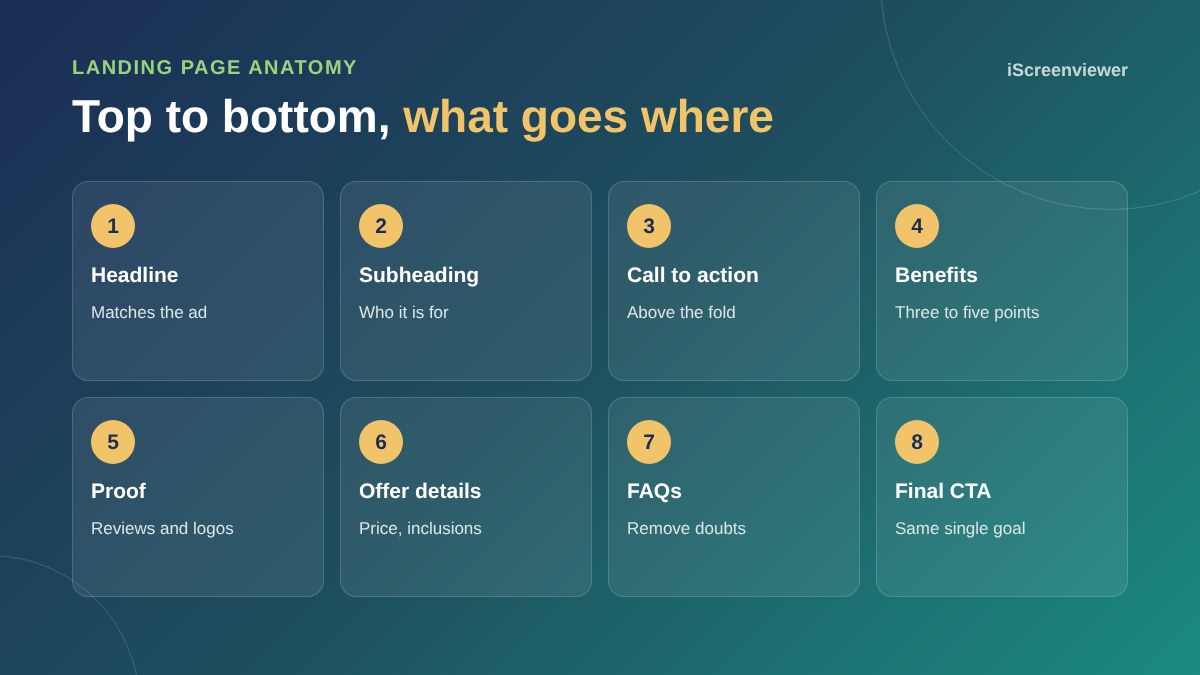
Decide the single action you want: book a call, request a quote, download a guide or buy. Every section should push towards that one action. If you have two offers, build two landing pages.
2. A headline that matches the click
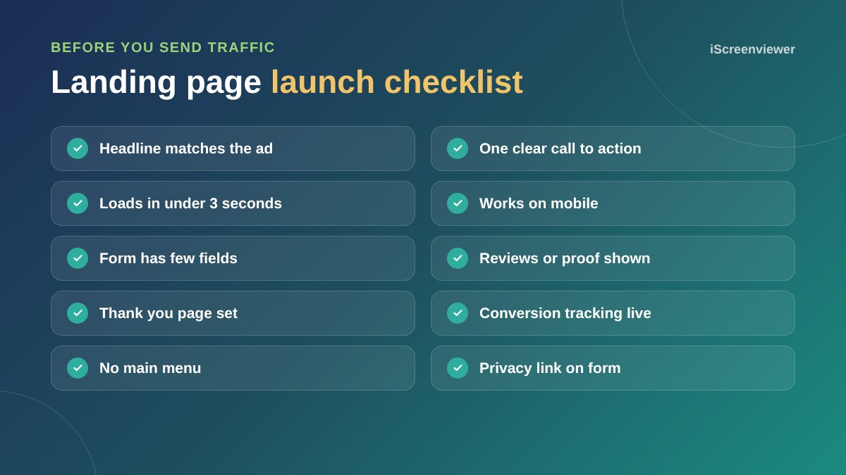
If your ad says Emergency Plumber in Parramatta, your headline should say the same thing. This is called message match, and it reassures visitors they are in the right place within a second or two.
3. A clear call to action above the fold
Visitors should see your main button or form without scrolling, on desktop and mobile. Use action words that describe what happens next, such as Get my free quote, rather than Submit.
4. Benefits, not features
List three to five reasons to choose you, written from the customer's side. Same-day service is a feature. Your hot water back on today is a benefit.
5. Proof
Real reviews, star ratings, client logos, before and after photos, certifications and numbers you can back up all build trust. Put at least one piece of proof near your call to action.
6. A clear offer
Tell people exactly what they get, what it costs or how pricing works, and how long it takes. Vague offers create questions, and questions create drop-offs.
7. Short forms
Ask only for what you need to follow up. Name, email or phone and one qualifying question is often enough. If you need more detail, a step-by-step form that asks one question at a time usually feels easier to complete than one long form.
8. No main menu
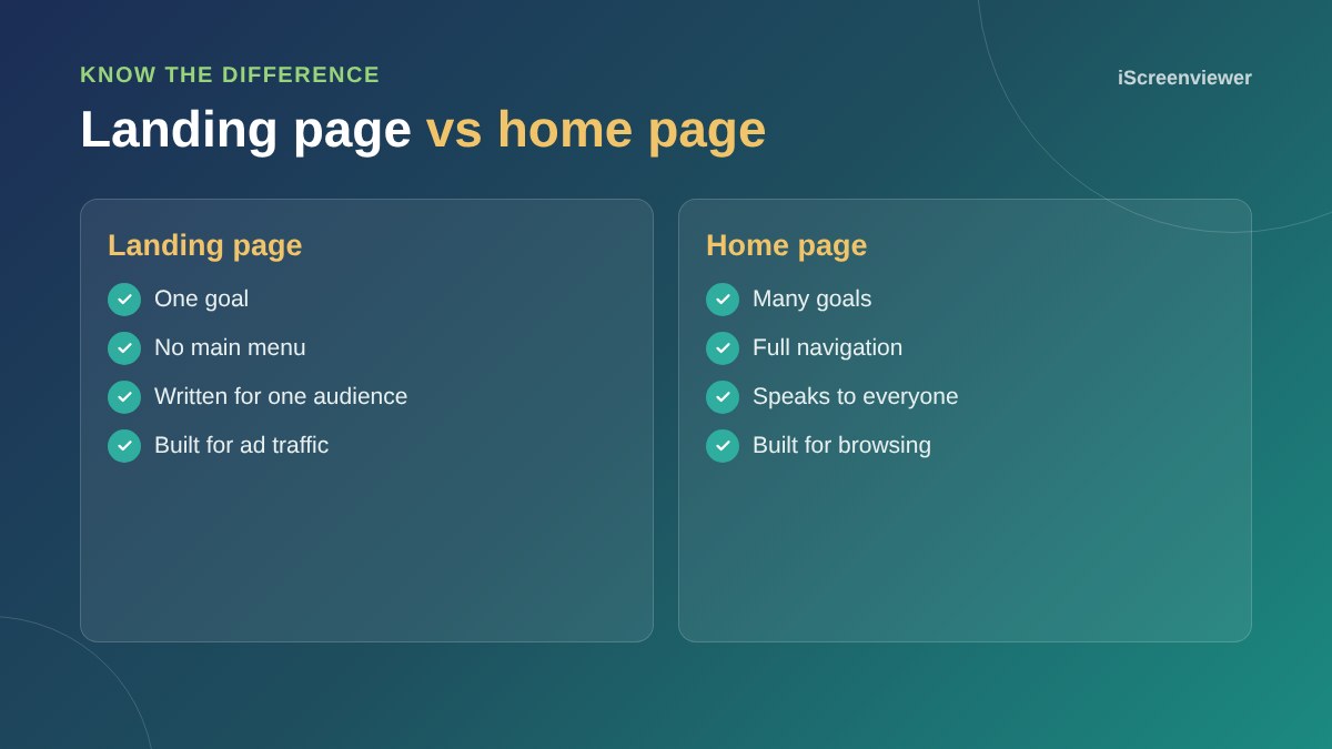
A landing page is not your home page. Remove the main navigation and unrelated links so visitors are not tempted away.
9. Fast and mobile-first
Most ad traffic arrives on a phone. Compress images, avoid heavy sliders and videos that autoplay, and test the page on a real mobile connection. Every extra second of loading time gives people a reason to leave.
10. Tracking that works
Set up conversion tracking for form submissions, calls and purchases in Google Analytics and your ad platform, and send people to a thank you page so conversions are easy to measure. Without tracking, you cannot tell which ads are working.
Common landing page mistakes
- Sending ad traffic to the home page
- Generic headlines that could suit any business
- Stock photos that add nothing
- Forms with eight or more fields
- No reviews or proof
- Slow pages full of plugins and animations
- No conversion tracking
How to keep improving
Once your page is live, test one change at a time: the headline, the offer or the form length. Run each version long enough to get a meaningful number of visitors before deciding. Small improvements in conversion rate can make a big difference to your cost per lead.
For more on planning pages around your customers, read UX and UI design for small business websites.
Need a landing page built?
The Landing Page: Design, Build and Go Live package gives you a fast, mobile-first landing page designed around one goal, with a form, tracking and your branding, for a fixed price.
Frequently asked questions
What is a good landing page conversion rate?
It depends on your industry, offer and traffic source. Rather than chasing an average, measure your own rate and improve it over time with one change at a time.
Should a landing page have a menu?
Usually not. Removing the main menu keeps visitors focused on one action. Keep only essential links such as your privacy policy.
How long should a landing page be?
Long enough to answer the questions people have before acting. Simple, low-cost offers can be short. Higher-value services usually need more detail, proof and FAQs.
How many form fields should a landing page have?
As few as you need to follow up properly. Name, contact details and one qualifying question is a good starting point.
Can I use my home page as a landing page?
You can, but it usually converts worse. A home page serves many audiences and goals, while a landing page focuses on one offer and one action.
Do landing pages help SEO?
They can, but most landing pages are built for paid traffic. A page designed to rank in Google usually needs more content than a focused ad landing page.