

Mobile-first web design means designing your website for phones first, then expanding it for tablets and desktops. Because most visitors arrive on a phone and Google uses the mobile version of your site for indexing, a mobile-first site tends to be faster, clearer and better at turning visitors into customers than a desktop design squeezed onto a small screen.
Why it matters
For many small businesses, most website visits come from phones, especially from Google searches and social media. If your site is hard to use on a phone, those visitors leave and contact someone else.
Google uses your mobile site
Google indexes the mobile version of your website. If content, links or structured data are missing on mobile, Google may not see them at all.
Design choices that matter
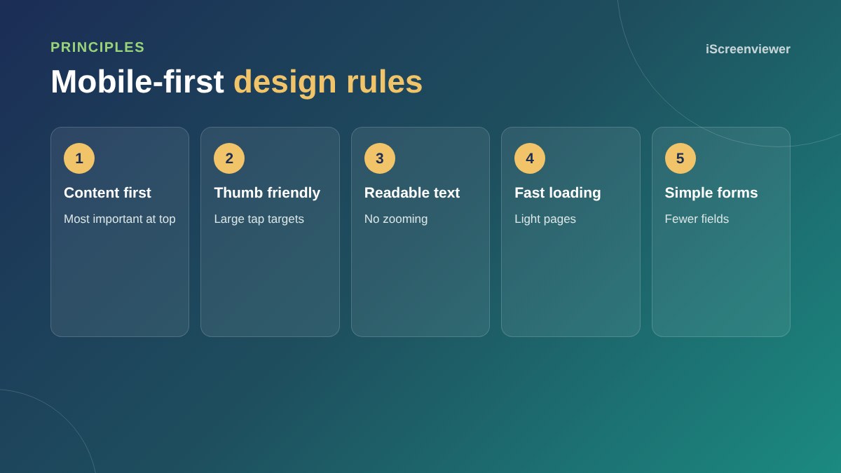
- Put the most important content and the main action at the top
- Use text at least 16px so nobody needs to zoom
- Make buttons and links large enough to tap with a thumb
- Make phone numbers tap to call
- Keep forms short and use the right keyboard for each field
- Avoid popups that cover the screen
Speed is part of design
Phones often load sites over mobile data. Optimised images, fewer scripts and a light theme make a big difference.
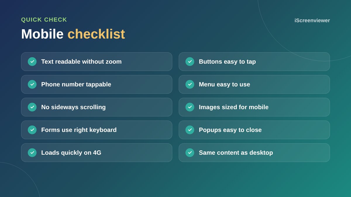
To test your current site, read how to check if your website works on mobile.
Navigation on small screens
A mobile menu should be simple, with the most important links first and a clear call or quote button that stays visible. Avoid deep menus with many levels, which are hard to use with a thumb.
Images and video
Serve smaller images to phones, use modern formats such as WebP and avoid large autoplay videos in the first screen. A poster image with a play button is often a better choice on mobile.
Test with real content
Designs often look perfect with short placeholder text and break with real headings, long product names or big tables. Test every page type with real content on a real phone before launch, including forms and checkout.
A mobile-first approach also helps accessibility, as larger text, clear buttons and simple layouts help everyone. See website accessibility basics.
Need your site fixed for mobile?
The Mobile and Tablet Responsiveness package fixes layout, text, buttons and menus on phones and tablets.
Frequently asked questions
What is mobile-first design?
Designing a website for phones first, then adapting it for larger screens.
Is responsive design the same as mobile-first?
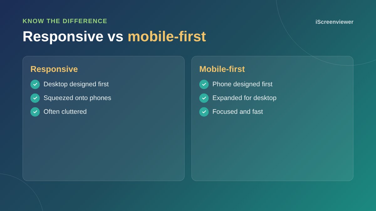
Not quite. Responsive design adapts to screen sizes, while mobile-first starts the design from the phone.
Does Google rank mobile-friendly sites higher?
Google indexes the mobile version of sites, and a poor mobile experience can hurt performance.
What text size should a mobile site use?
At least 16px for body text, so people do not need to zoom.
How do I know if my site works on mobile?
Test it on real phones and use Chrome's device mode and PageSpeed Insights.
Should mobile and desktop show the same content?
Yes. Layout can change, but important content should be on both.