

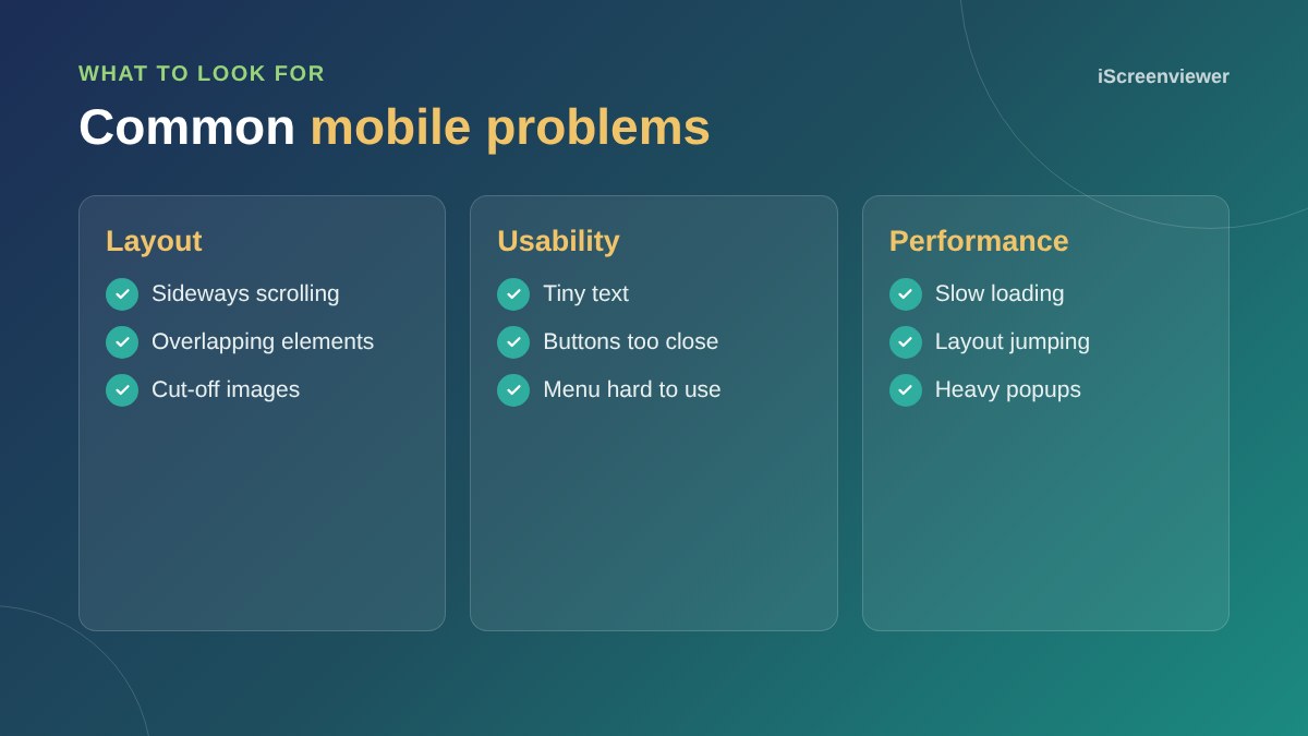
The best way to check if your website works on mobile is to use it on real phones: browse the main pages, open the menu, tap the phone number, fill in a form and, for stores, place a test order. Then use Chrome's device mode to check other screen sizes and PageSpeed Insights to check mobile speed. Look for tiny text, buttons that are hard to tap, sideways scrolling and slow loading.
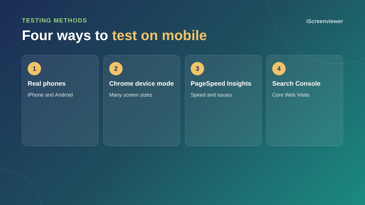
1. Test on real phones
Use at least one iPhone and one Android phone, on mobile data rather than office Wi-Fi. Try the tasks your customers do most.
2. Chrome device mode
In Chrome, right-click a page, choose Inspect, then click the device icon. You can preview many screen sizes and slow down the connection to see how the page loads.
3. PageSpeed Insights
Enter a page address to see mobile performance scores, Core Web Vitals from real visitors where available, and suggestions.
4. Google Search Console
The Core Web Vitals report shows which pages are slow or unstable for mobile visitors across your whole site.
What to fix first
Fix anything that stops people contacting you or buying: broken forms, hidden buttons, a menu that does not open or a checkout that does not work. Then fix readability and speed.
For design principles, see mobile-first web design.
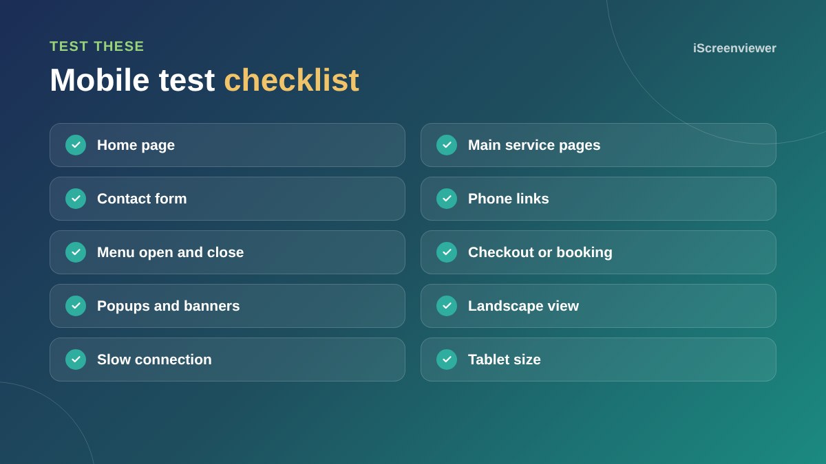
Test your forms and checkout
Forms are where mobile problems cost the most. Check that each field opens the right keyboard, such as numbers for phone fields, that error messages are visible, and that the submit button is not hidden behind a cookie banner or chat widget. For stores, complete a full test order on a phone, including payment with Apple Pay or Google Pay.
Watch for layout shift
If buttons or text jump as the page loads, people tap the wrong thing. This is measured as Cumulative Layout Shift. Common causes are images without set dimensions, late-loading banners and web fonts.
Make it a routine
Plugins, theme updates and new content can break mobile layouts without warning. Check your key pages on a phone after every update and at least once a month.
Want your mobile issues fixed?
The Mobile and Tablet Responsiveness package tests and fixes your site on phones and tablets.
Frequently asked questions
How do I test my website on mobile?
Use it on real phones, then check other sizes with Chrome's device mode and speed with PageSpeed Insights.
Is there a Google mobile-friendly test?
Google retired its standalone test. Use PageSpeed Insights, Lighthouse and Search Console's Core Web Vitals report instead.
Why does my site look different on my phone?
Themes adapt layouts to screen size, and some elements may be hidden or rearranged on mobile.
What screen sizes should I test?
A small and large phone, a tablet and a desktop.
How do I make my phone number clickable?
Link it with tel: followed by the number, so it opens the phone app.
Does mobile speed matter?
Yes. Slow mobile pages lose visitors and can affect search performance.