

Every small business needs four branding basics: a simple, versatile logo with an icon version, a small colour palette of two or three brand colours plus neutrals, two fonts for headings and body text, and a short style guide that records them all. Used consistently on your website, social media, signage and documents, these make your business look established and easy to recognise.
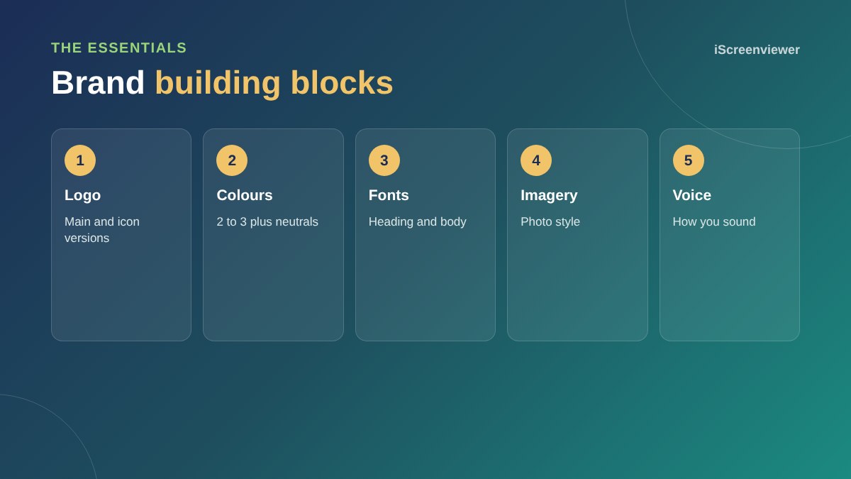
Your logo
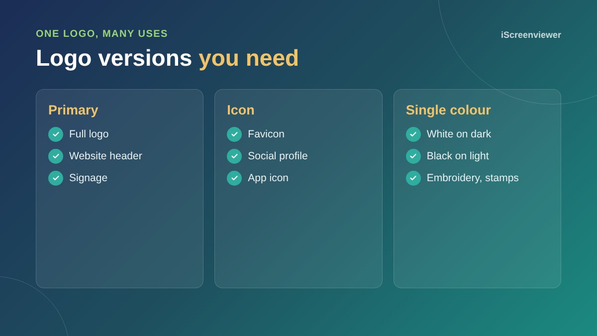
A good logo is simple, readable at small sizes and works in one colour. You need a primary version for your website and signage, an icon version for favicons and social profiles, and single-colour versions for dark and light backgrounds. Keep the original files, ideally SVG plus high-resolution PNG.
Colours
Choose one main brand colour, one or two accent colours and neutral tones for text and backgrounds. Record the exact codes (HEX for web, CMYK for print). Check that text colours have enough contrast to be readable, which also helps accessibility.
Fonts
Two fonts are usually enough: one for headings with personality and one clear, readable font for body text. Make sure both are available as web fonts so your website matches your printed materials.
Imagery and voice
Decide how your photos should look, such as bright and natural or bold and high contrast, and how you sound in writing, such as friendly and practical. These details make a brand feel consistent even when different people create content.
A simple style guide
A brand style guide puts all of this in one place: logo files and rules, colours, fonts, examples and dos and don'ts. Share it with anyone who designs, writes or builds for your business.
Common branding mistakes
- A detailed logo that becomes unreadable on a phone or favicon
- Too many colours used inconsistently
- Different fonts on the website, social media and print
- Low-resolution logo files that look blurry
- Changing the look every few months
Your website is where your brand works hardest. See UX and UI design for small business websites.
When to refresh your brand
A brand refresh makes sense when your business has changed direction, your logo looks dated or does not work on mobile, or you have grown and your look no longer matches your prices and customers. A refresh can be as small as tidying the logo and colours, without starting again.
Applying your brand to your website
Your website should use your brand colours for buttons and highlights, your fonts for headings and body text, and your photo style throughout. Keep enough white space so the brand colours stand out rather than overwhelm. Use your icon logo as the favicon so your brand shows in browser tabs and bookmarks.
Need a logo or style guide?
See Logo Design for Small Business and Brand Style Guide.
Frequently asked questions
What does a small business need for branding?
A logo with icon and single-colour versions, a small colour palette, two fonts and a simple style guide.
How many brand colours should I have?
Two or three brand colours plus neutral tones is usually enough.
What logo file formats do I need?
SVG for the web and print, plus high-resolution PNG files with transparent backgrounds.
How many fonts should a brand use?
Usually two: one for headings and one for body text.
What is a brand style guide?
A document that sets out your logo, colours, fonts, imagery and tone so everything stays consistent.
Should my website match my branding?
Yes. Your website should use the same logo, colours and fonts as everything else.