

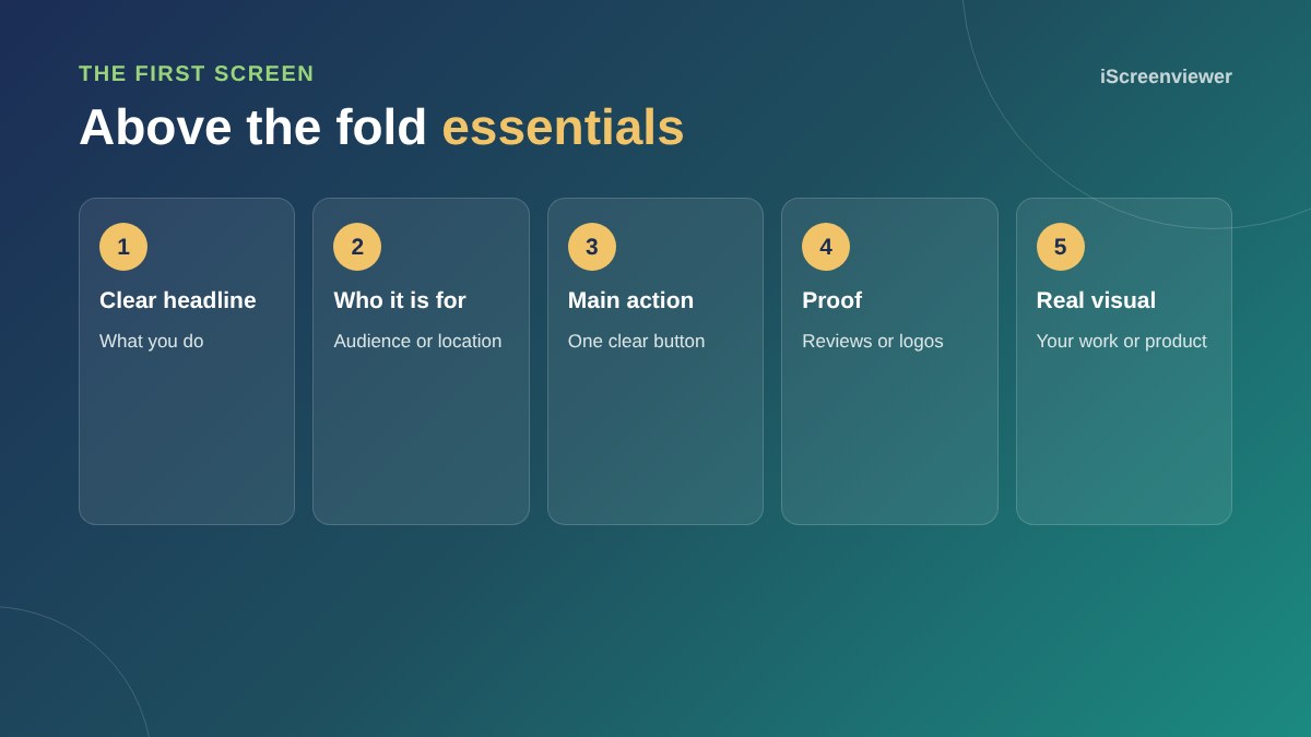
Above the fold, the part of your home page visible before scrolling, should tell visitors what you do, who you do it for and what to do next, within a few seconds. Include a clear headline, a short supporting line, one main call to action, a trust signal such as reviews or client logos, and a real image of your work or product.
Lead with a clear headline
Say what you do in plain words. Clever slogans rarely beat a clear statement. Add your location if you serve a local area.
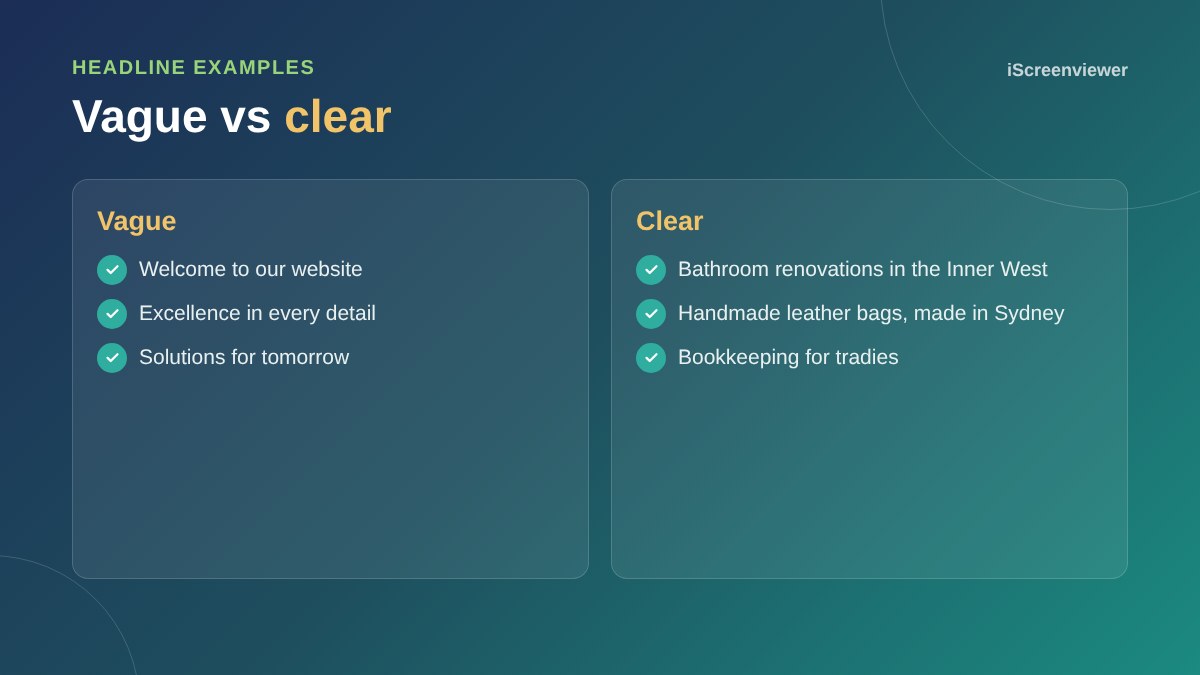
Support it with one line
Use a short subheading to add who you help, what makes you different or the main benefit.
One main call to action
Choose the action that matters most, such as Get a quote or Shop now. A second, lighter link is fine, but avoid a row of competing buttons.
Show proof early
A star rating, review count, client logos or years in business near the top reassures new visitors straight away.
Use real visuals
Photos of your team, work or products build more trust than generic stock images. Avoid heavy sliders: most people never see past the first slide, and they slow the page.
Design for mobile first
On a phone, the first screen is small. Make sure the headline and button are visible without scrolling and the phone number is easy to tap. See mobile-first web design.
What comes after the fold
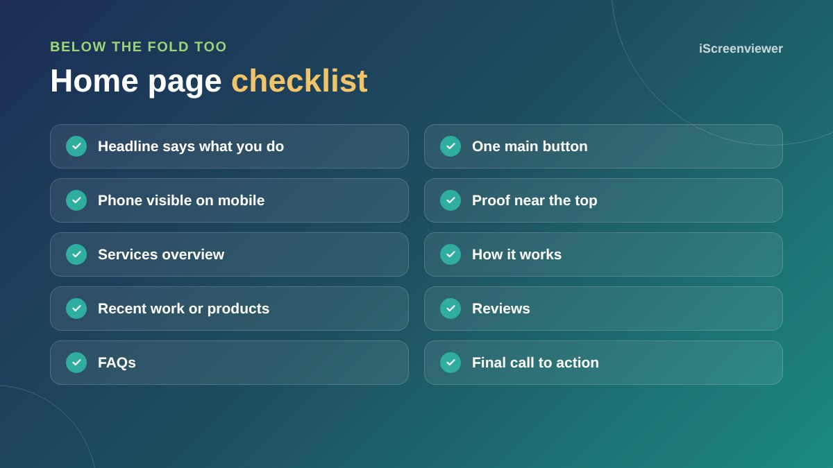
Below the first screen, cover your services, how you work, recent work, reviews and FAQs, then finish with another call to action.
For pages built for ads, see what makes a high-converting landing page.
Navigation that helps
Keep the main menu short, with five to seven clear items such as Services, Work, About and Contact. Put the most important button, such as Get a quote, in the top right. On mobile, make sure the menu icon is easy to find and the call button stays visible.
Test it with real people
Show your home page to someone who does not know your business for five seconds, then ask what you do and what they would click next. If they cannot answer, your headline or call to action needs work. This simple test catches most above-the-fold problems.
Common mistakes
- Generic stock images that could belong to any business
- Several buttons all competing for attention
- Autoplay videos that slow the page
- Headlines about you rather than your customers
- Contact details hidden in the footer
Want a better home page?
The Home Page Design package gives you a clear, modern home page designed to turn visitors into enquiries.
Frequently asked questions
What does above the fold mean?
The part of a web page visible before scrolling.
What should a home page headline say?
What you do, in plain words, ideally with who you help or where you work.
Should I use a slider on my home page?
Usually not. Sliders slow the page and most visitors only see the first slide.
How many buttons should be above the fold?
One main call to action, with at most one secondary link.
Does above the fold matter on mobile?
Yes, even more, because the screen is smaller.
How long should a home page be?
Long enough to cover services, proof and next steps, usually several short sections.